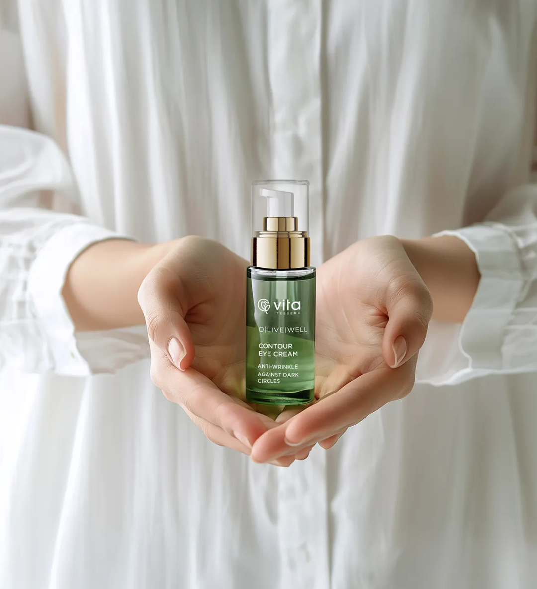
In today’s skincare industry, brand identity and packaging design often shape consumers’ first impressions. For our team, designing this skincare collection was a creative journey pursuing serenity, purity, and tranquility. Our philosophy draws from the potent forces of nature, harnessing its ingredients to nurture every inch of skin. Thus, we crafted a visual identity that feels honest and grounded, reflecting the brand’s commitment to natural ingredients and reverence for nature.
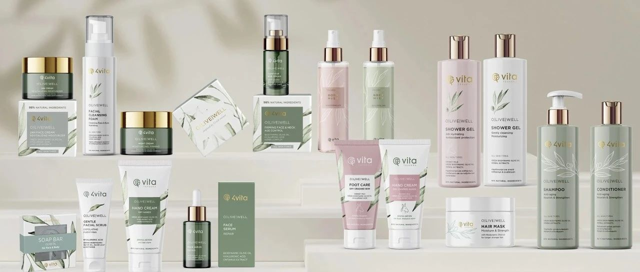
Inspired by the brand’s core ethos—powerful natural ingredients for deep skin nourishment—the formulations feature Greek biodynamic olive oil, donkey milk, hyaluronic acid, and up to 90% naturally derived components. This purity became the foundation of our design. Every detail ensures consumers sense the product’s innate naturalness.
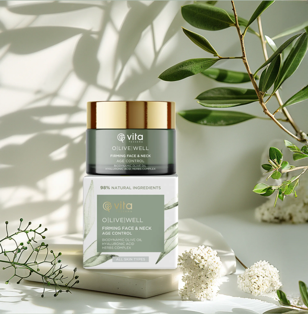
For the color palette, we selected soft, earthy tones: sage green, creamy beige, and dusty pink, mirroring nature’s hues. These shades resonate with organic ingredients while evoking calm and harmony. Subtle gold accents elegantly echo the premium natural actives within, reinforcing the product’s organic roots and philosophy of purity.
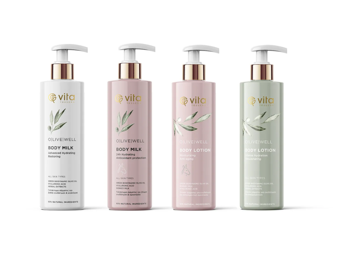
Embracing minimalism, we crafted clean yet expressive packaging structures. Meticulous typography, generous whitespace, and restrained graphics create a refreshing visual experience. Every blank space amplifies the product’s presence, ensuring the high-performance formulas remain the focal point—undistracted by excessive ornamentation.
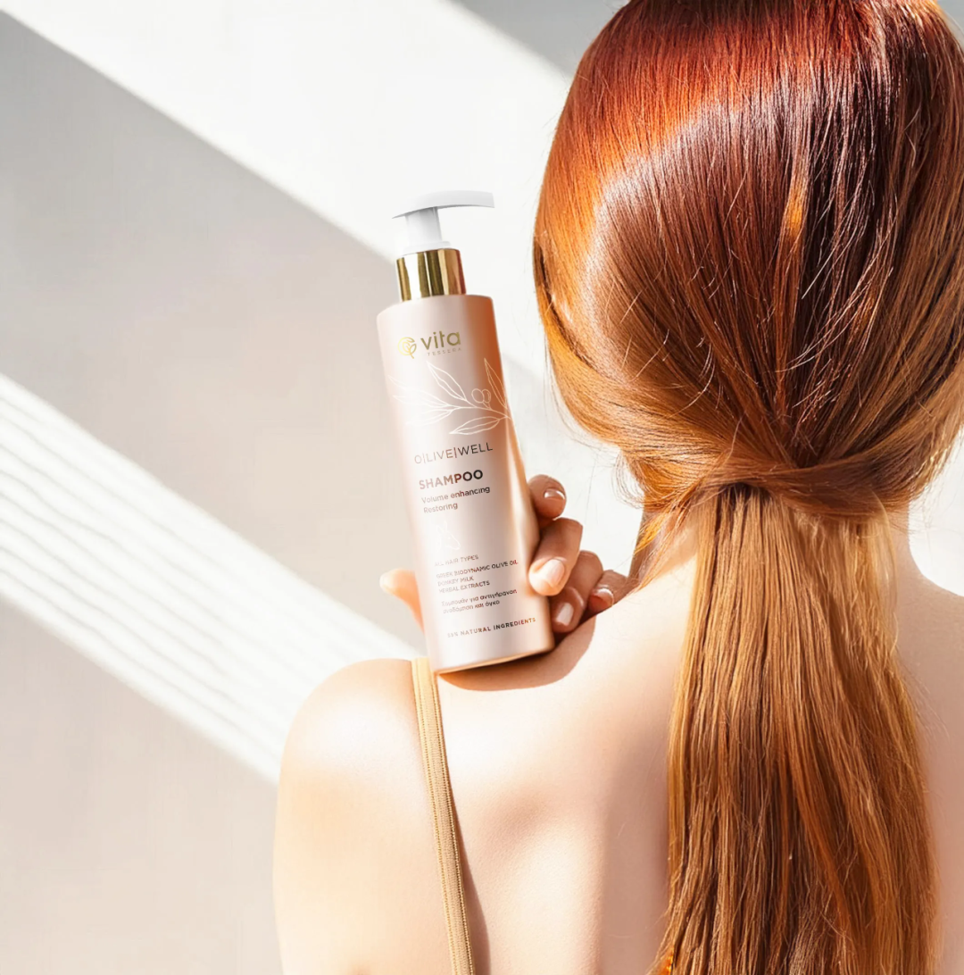
Every element, from material textures to shadow play, was deliberately chosen. We want users to feel an authentic tactile connection, as if touching nature itself. Packaging, to us, is not just a vessel but a tool to evoke emotional resonance.

